Mission 07 · Completed · Delivered to development
Modular LandingPage System
One landing-page structure serving multiple app launches — functions, reviews and FAQs in a repeatable layout that re-themes per product instead of being redesigned each time.
Project snapshot
- Role
- User Interface Designer
- Project type
- Marketing landing pages for mobile app launches
- Team
- Client engagement; designs handed to an IT development team for build
- Status
- Delivered to the development team
Tools & methods
- Marketing trend research
- Feature analysis
- Prototyping
- Theme and content design
Context
New apps need somewhere to land. Not a full marketing site — a single page that explains what the product does, shows it working, answers the obvious objections and gets someone to the download button.
The brief covered more than one product, which changes the problem. Designing one landing page is a layout exercise. Designing the second one for a different product is where you find out whether the first was a structure or just a picture.
Design problem
Different products, same job
A campus food app and a fitness app share almost no content, but they need to answer the same sequence of questions in the same order.
Redesigning every time is waste
Treating each launch as a blank page means re-solving hierarchy, rhythm and conversion placement for every product.
Identity still has to differ
Shared structure cannot mean shared personality. Each product needed to look like itself.
My role
User Interface Designer. My responsibility was analysing the features of the apps, then designing the prototype, the theme and the content.
The finished designs were refined against client feedback and handed to an IT development team to build.
Responsibilities
- Conducted marketing trend research
- Analysed the features of each app to decide what the page needed to communicate
- Conducted design idea research
- Designed the page prototype
- Designed the theme for each product
- Designed the page content and copy structure
- Enhanced the design according to client feedback
- Delivered the designs to the IT development team
Design process
Three phases: research, design, and enhancement to handover.
- T-01Marketing trend researchLooked at how comparable products were presenting themselves before deciding how these should.
- T-02Feature analysisWorked through each app's features to identify the few worth putting on a landing page — the ones that would make someone download.
- T-03Design idea researchGathered visual and structural directions to work from rather than starting from a blank canvas.
- T-04Prototype designEstablished the page structure: hero, functions, reviews, FAQ, conversion.
- T-05Theme designGave each product its own palette and personality within that structure.
- T-06Content designWrote and arranged the content so the page argues rather than just lists.
- T-07Client enhancementRefined the designs according to client feedback.
- T-08Development handoverDelivered the finished designs to the IT development team for build.
The system across two products
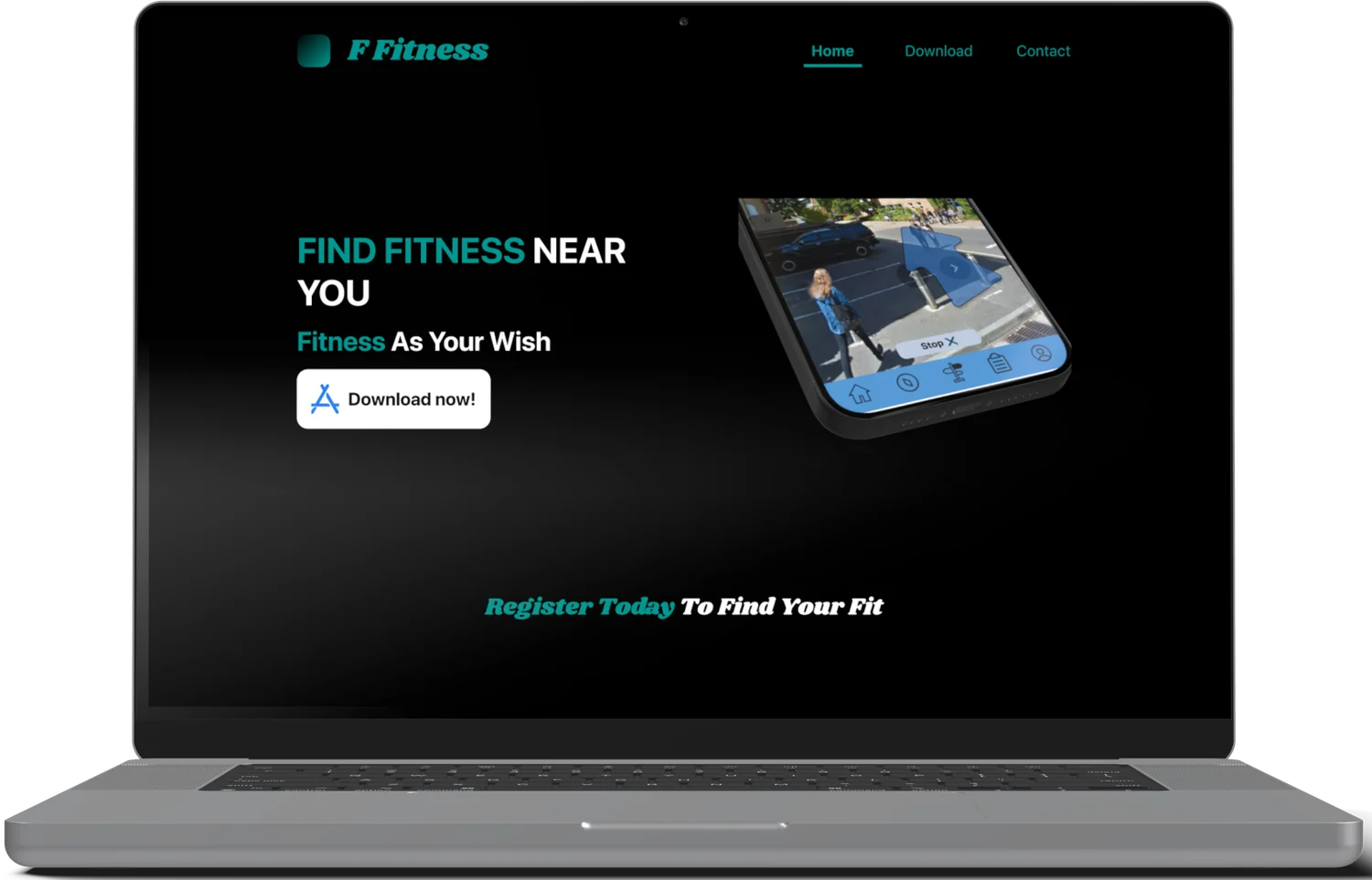
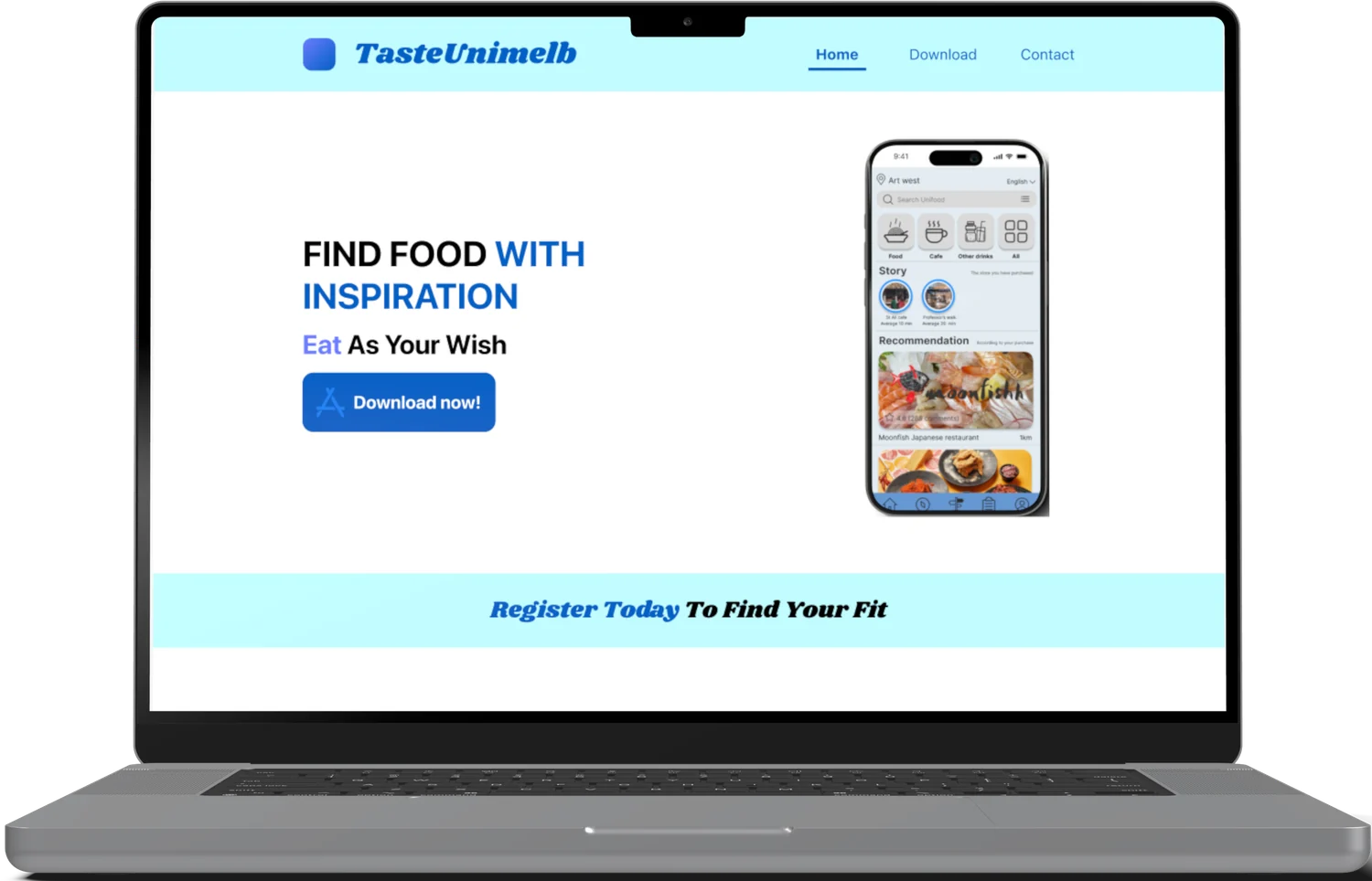
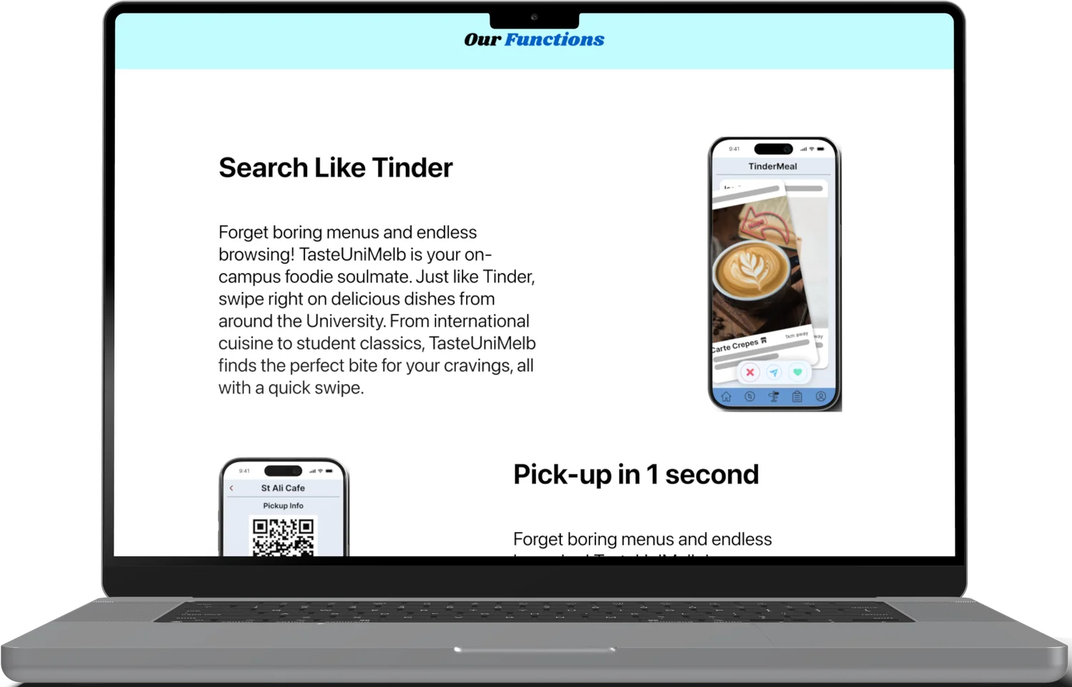
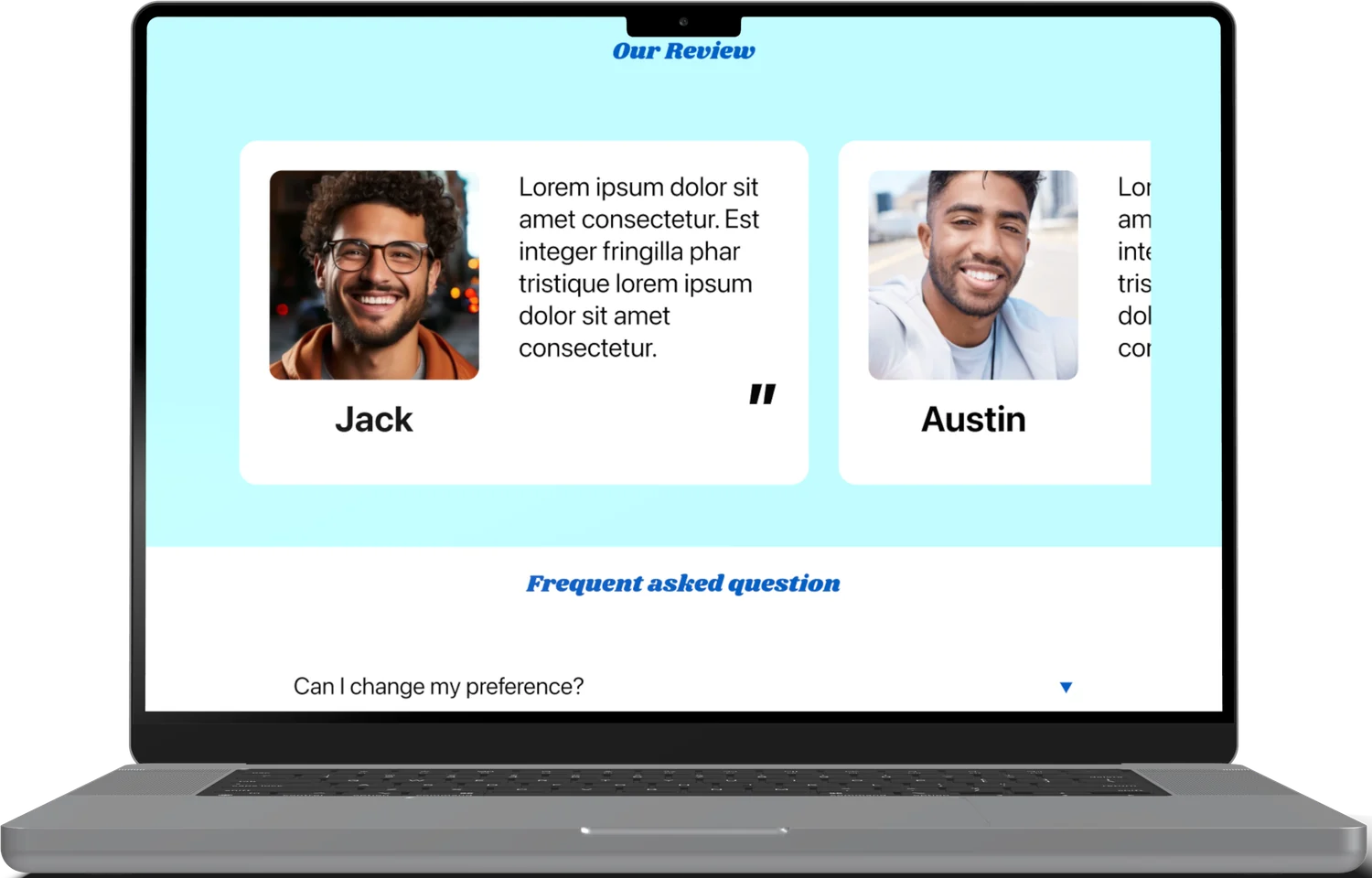
The same structural sequence, themed twice: a campus food discovery app in bright cyan and blue, and a fitness app in near-black and teal.
The page structure
The sequence every page follows. It is deliberately an argument, not a list — each block answers the question the previous one raises.
01 · Hero
Product name, a claim in two lines, a supporting line, and the download action — visible without scrolling
02 · Conversion strip
A full-width band restating the invitation, catching anyone already convinced
03 · Functions
One capability per row, alternating text and device mockup, so the page has rhythm rather than a wall of features
04 · Reviews
Social proof, placed after the product has been explained and not before
05 · FAQ
Expandable answers to the objections that stop a download
06 · Close
Final conversion and contact
What makes it a system
Structure is fixed, theme is not
Both products run the identical block sequence. What changes is palette, typography weight and imagery — which is why the second page took a fraction of the effort of the first.
Feature analysis decides the content
Each row of the functions section comes from the analysis step, so the page shows the capabilities that sell the product rather than everything it does.
Devices carry the proof
Every claim is paired with a screen showing it. The page never asks the visitor to take a feature on trust.
Objections handled last
The FAQ sits immediately before the final call to action, where the remaining hesitation actually is.
Built to hand over
A repeating block structure is far easier for a development team to implement as components than a bespoke layout per product.
Reflection
The second product is where a layout becomes a system. Designing the food app's page raised a set of decisions — where proof goes, when to ask for the download, how many features is too many — and the fitness page tested whether those decisions were about landing pages generally or about that one product specifically. Most of them held.
The other thing it taught me is that handover shapes design. Knowing an IT team would build this from the designs pushed me towards a repeating block structure, which was better for them to implement and, as it turned out, better for the visitor to read.