Mission 06 · Completed · Delivered to client
Digital TicketingExperience
A sports ticketing app designed around personal preference and group plans — pick the sports you follow, get events surfaced to match, and organise going with friends.
Project snapshot
- Role
- User Interface Designer
- Project type
- Mobile application · sports event ticketing
- Team
- Client engagement
- Status
- Prototypes delivered and refined against client feedback
Tools & methods
- Market and competitor research
- Mind mapping
- Low-fidelity prototyping
- High-fidelity prototyping
Context
Buying a ticket to a live sports event is rarely a solo decision. People follow particular sports and particular teams, and the moment that matters is usually not "find a ticket" but "work out what's on that we would actually go to, and get everyone to agree."
The brief was to design an app that handled both halves of that: buying tickets according to personal preference, and organising the outing with friends.
Design problem
Generic listings bury the relevant
A ticketing platform that treats every event equally makes the user do the filtering. Someone who only follows rugby and cricket should not have to skim past everything else.
Going is a group decision
Ticketing tools are built around a single buyer, while the actual behaviour is a group deciding together. The product had to hold both.
A crowded category
Competitor analysis was part of the brief precisely because this is a well-served market — the design needed a reason to exist beyond parity.
My role
User Interface Designer. My responsibility covered researching design ideas and competitors, developing the user journey, and designing the prototypes.
This was client work, and the design was refined against client feedback rather than delivered as a single proposal.
Responsibilities
- Researched design ideas and competitor products
- Identified business needs and contributed to business strategy
- Conducted market research
- Created a mind-map of the user journey and required functions
- Designed low-fidelity prototypes
- Designed high-fidelity prototypes
- Refined the design according to client feedback
Design process
Two phases, as documented at the time.
- T-01Business needsIdentified what the product had to achieve commercially before any interface work started.
- T-02Business strategyDeveloped the strategy the design would need to support.
- T-03Market researchResearched the ticketing market to understand what users already expect from the category.
- T-04Competitor analysisAnalysed existing products to find where the design could differentiate rather than duplicate.
- T-05User journey mind-mapMapped the journey and the functions it required — the artefact that turned research into a feature set.
- T-06Low-fidelity prototypeEstablished structure and flow before committing to any visual decisions.
- T-07High-fidelity prototypeBuilt out the full interface, including the preference onboarding and event discovery screens.
- T-08Client refinementEnhanced the design according to feedback from the client.
The interface
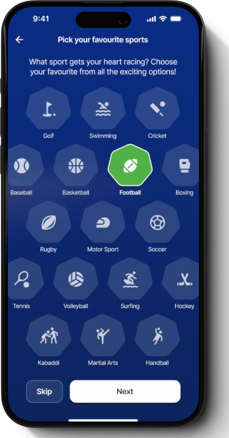
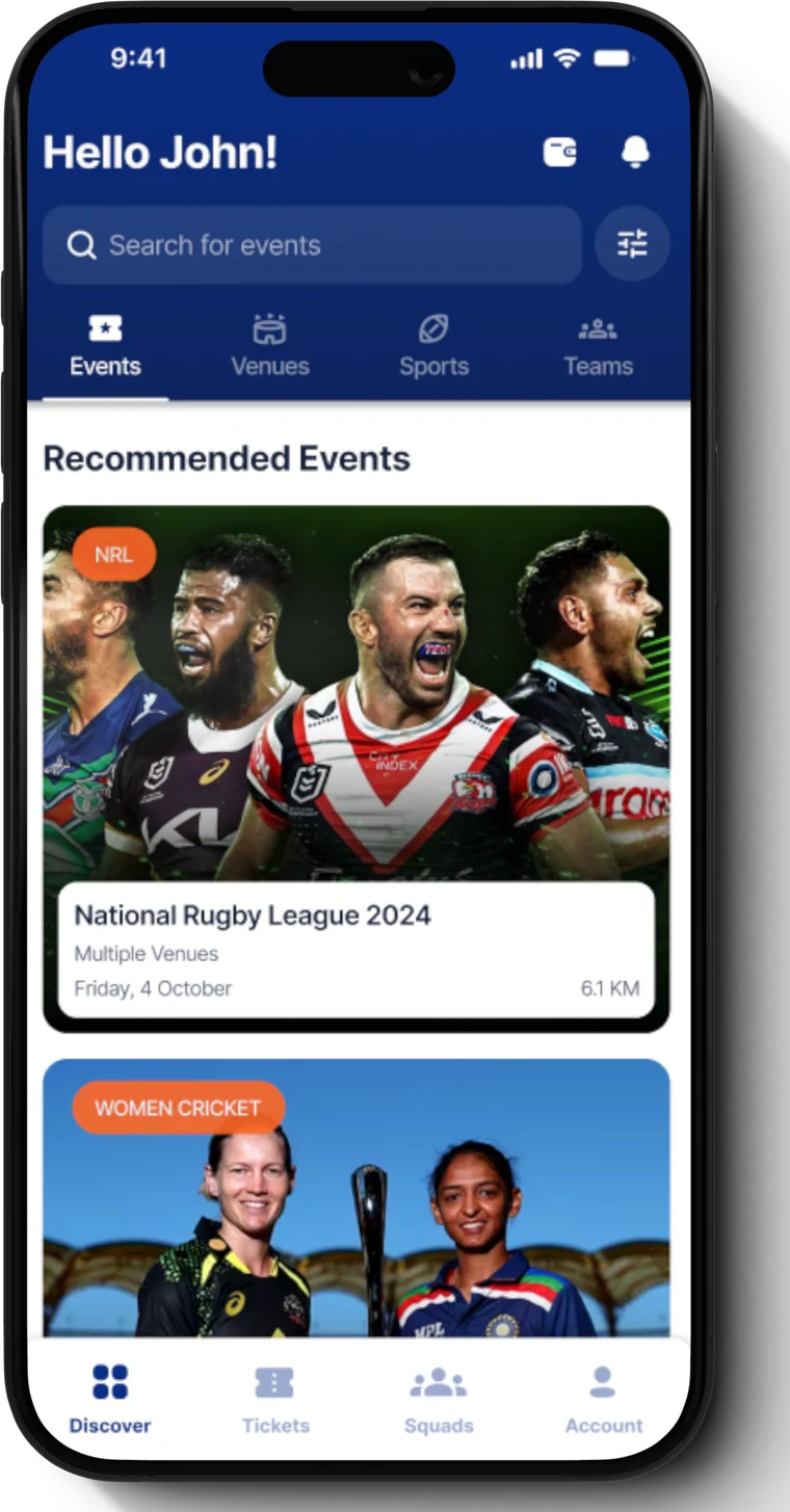
Two screens from the high-fidelity prototype: preference capture during onboarding, and the personalised discovery surface it feeds.
Interface decisions
Preference before browsing
Onboarding asks which sports get your heart racing before showing a single event, so the first screen a user sees is already filtered to them.
Skippable, not mandatory
The preference step carries a Skip control. Onboarding that blocks the product is onboarding people abandon.
Four ways in
Events, Venues, Sports and Teams sit as peer tabs, because people arrive with different starting points — a team they follow, or a stadium they can get to.
Distance on the card
Each recommendation carries how far away it is, surfacing the constraint that usually decides whether an outing happens.
Squads as a primary destination
The group half of the product sits in the main navigation rather than inside a share menu, matching the reality that going is a group decision.
Reflection
The strongest decision here is the cheapest one: asking a single question during onboarding and letting it reshape the entire discovery surface. Personalisation that requires behavioural data takes weeks to become useful, while one tap works on the first session.
Looking back at it now, the piece I would push harder on is the group flow. Squads earned a place in the primary navigation, which was right, but the journey from "I found an event" to "we all have tickets" is where this product would either win or lose, and it deserved as much design attention as discovery received.